The Typeface Knows First: How Fonts Sell a Genre Before the Music Does
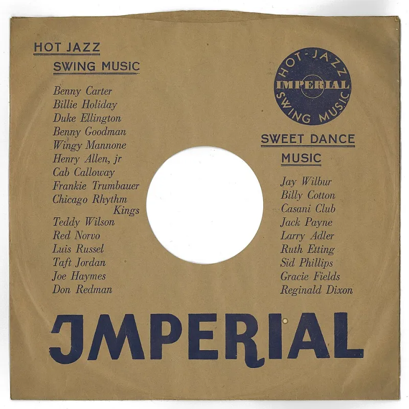
Photo: AnonymousUnknown author, Public domain, via Wikimedia Commons
Nobody plays an album anymore. They scroll past it. Which means the cover's first job isn't to be beautiful at twelve inches — it's to be legible at ninety-six pixels, in a carousel, next to thirty-nine other records that all want the same thumb.
That constraint reshaped an entire craft. The type designers and art directors behind American album packaging now work in two sizes at once: the square that lives in your phone, and the twelve-inch object that lives on a shelf and gets photographed for the internet. The letterforms have to survive both, and they have to say “metal” or “country” or “hyperpop” before a single note plays.
The Audition Lasts Half a Second
Ask anyone who does this for a living and they'll tell you the same thing: genre is read from shape, not from color. A thumbnail is too small for a palette to register. What reads is silhouette — the weight of the strokes, the amount of space inside the letters, whether the edges are sharp or soft.
So the working process starts with a size test. Art directors mock the cover into a fake streaming grid, dark mode and light, with the title overlay sitting exactly where the platform puts it. If the type turns to gray mush at that scale, it doesn't matter how good it looks on the vinyl sleeve. It gets redrawn, usually narrower and heavier.
Genre Is Basically a Set of Letters
The vocabulary is remarkably stable. Country covers lean on slab serifs, western spurs, hand-painted signage, and condensed gothics that look like they were routed out of plywood. Metal goes blackletter, or the opposite extreme — a logo so abstracted it functions as texture rather than language. Indie defaults to a neutral grotesk, close enough to Helvetica that it disappears, or to deliberately naive hand-lettering that signals honesty.
Hyperpop and its descendants want chrome bevels, stretched italics, Y2K techno faces, anything that looks like it was rendered on hardware that no longer exists. Hip-hop has spent thirty years oscillating between hyper-condensed grotesks and custom script, with the script doing most of the emotional labor.
What's interesting is how old some of these signals are. Cooper Black has been shorthand for warm and slightly goofy since the 1920s and shows no sign of retiring. A font isn't a style choice so much as a citation.
Where the Letters Actually Come From
Behind every one of those covers is a small independent type industry: one- and two-person foundries in Portland, Providence, Minneapolis, and a hundred spare bedrooms. Some sell retail licenses at fifty to three hundred dollars for desktop and web use. Album art is a gray area in a lot of those agreements, which is why labels increasingly buy an explicit artwork license or commission something exclusive.
Custom lettering runs roughly $1,500 for a single title treatment to $8,000 and up for an original display face with alternates and a full character set. Small labels have started treating a typeface as a house signature — one foundry drawing every cover on the roster, so that a stack of records reads as a family before you've checked the logo on the back.
Kerning for a Format That Keeps Changing
Variable fonts changed the math. One file can stretch from a forty-eight-point headline on a billboard to a sixty-pixel tile without the designer shipping six weights. Animated covers — a few frames of type sliding or glitching — mean the lettering has to work in motion, which is a different discipline than print.
The physical package still demands its own pass. A gatefold, a spine, a center label: each one is a separate typographic problem, and the design that sings on a phone often looks flimsy at twelve inches. Good art directors deliver both, plus alt crops for the endless reissues and deluxe editions that arrive two years later.
What Outlives the Record
Here's the thing nobody says out loud: most of these albums will be forgotten before the typeface is. Fonts are weirdly durable that way. A face drawn for a record that sold four hundred copies gets picked up five years later by a completely unrelated artist, then by a clothing brand, then by a streaming service's true-crime documentary. The album was the commission. The typeface was the career.
Which is probably why the designers doing this work take it so seriously. A record is a moment. A letterform is a piece of furniture that keeps getting moved into new rooms.